How might we enable retailers to get the maximum value from articles?
But why this one?

🔎 Reviewing current experience
After heuristic analysis of the platform, I could see the cross-platform experiences are significantly different, this led me to prepare themes which shaped the whole Suggestion experience.
01 Status quo of article cards
02 Identified different experiences
The Suggestions Ecosystem
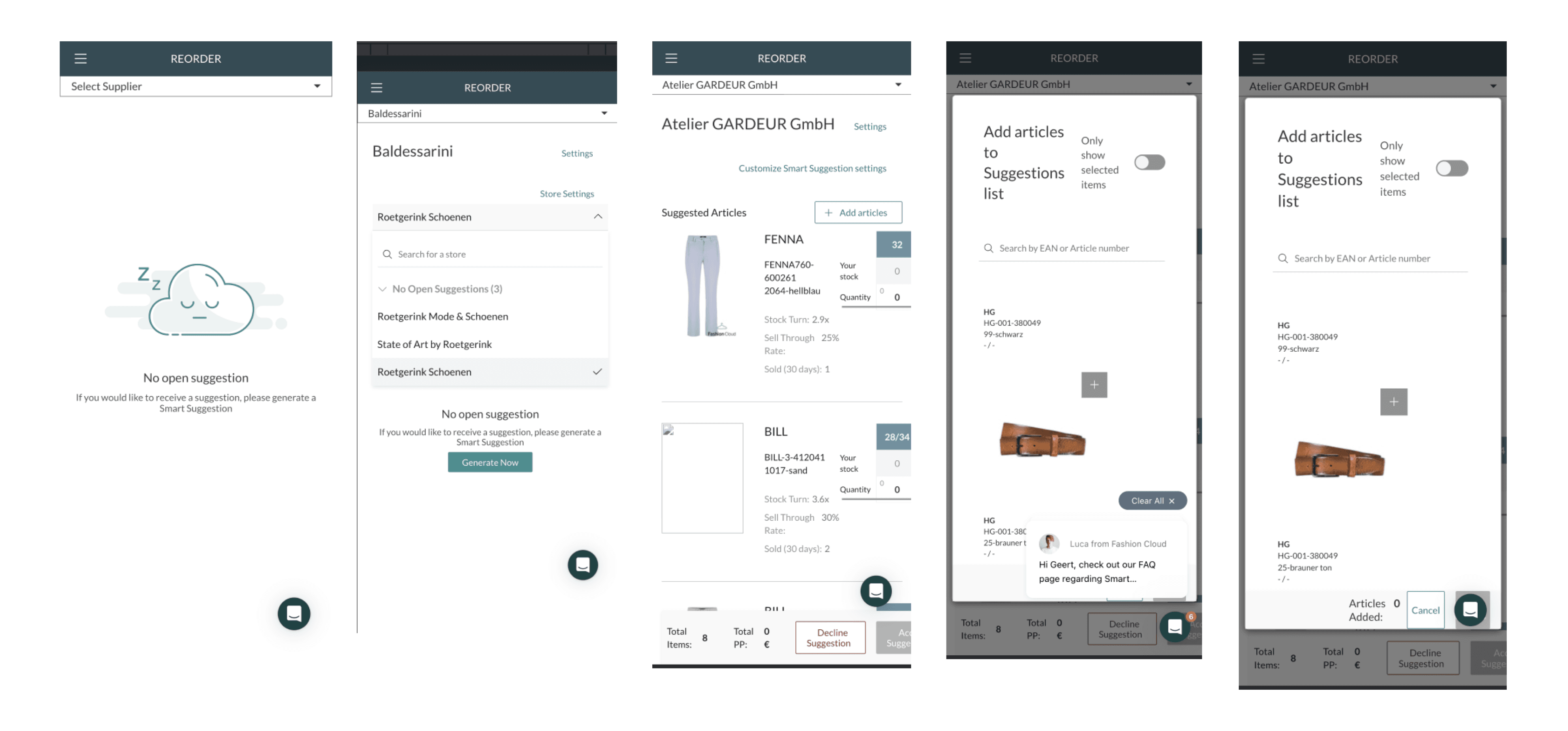
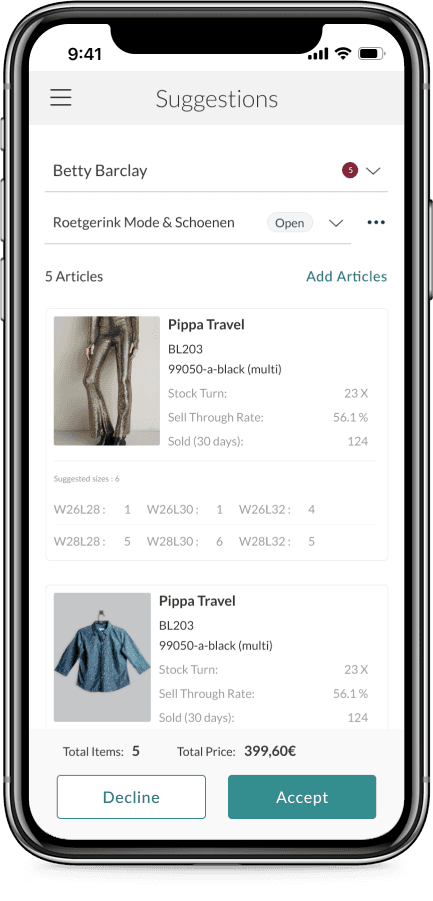
Add articles
Navigating brands
Taking action
Make changes
Generate new
🎯 Mapping user & business goals
Increased customer satisfaction by 50%.
💼 Business Impact
Smart
Rep UX
Improved user friendliness by 50%.
👭 User Impact
Retailer
Business
🔎 Applying mixed research methods

Getting together to identify users
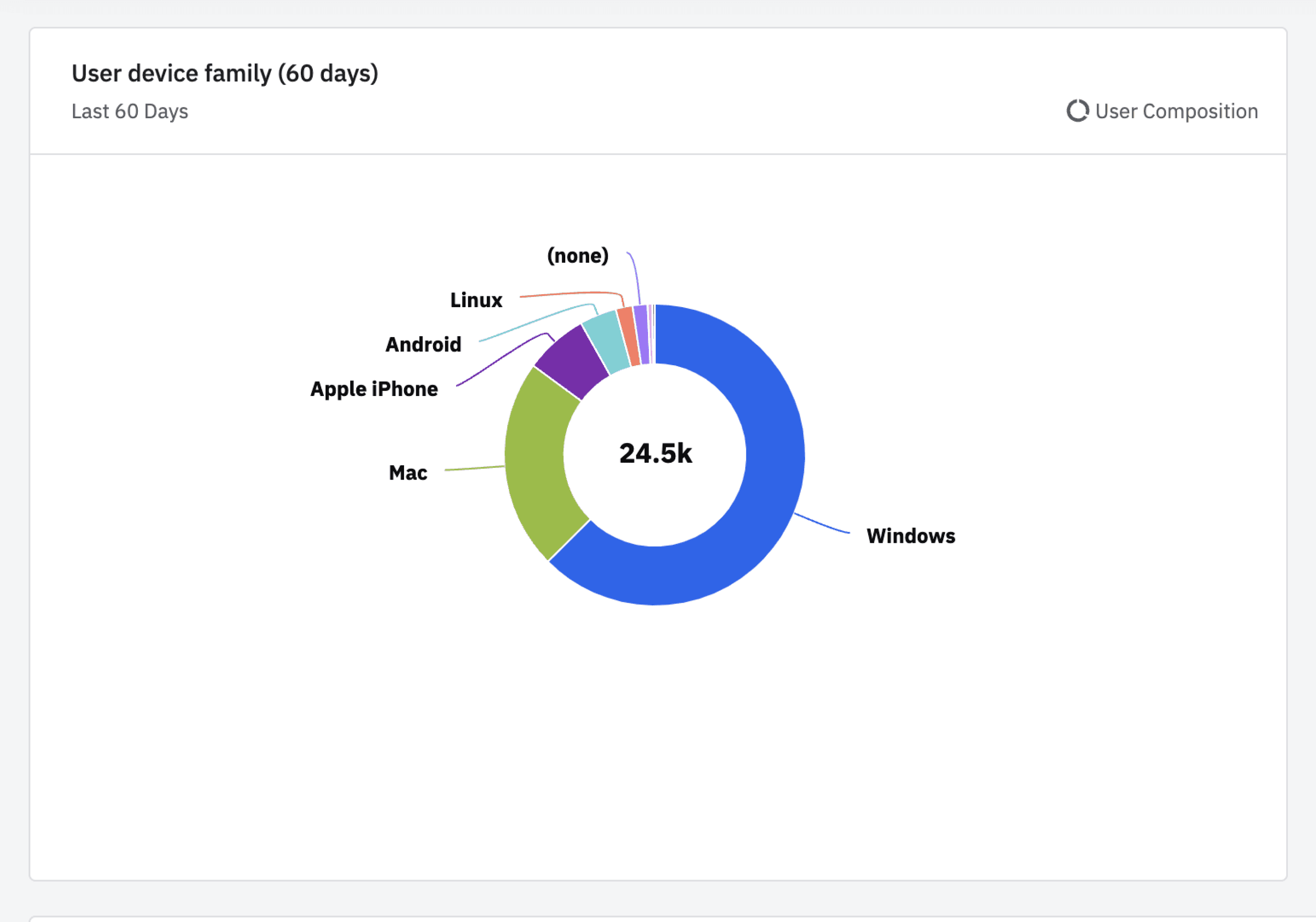
We explored the user eco system, where I identified the Retailer is the direct user.
I used amplitude to look at user type + device type the user adopts leading me to understand maximum traffic is through the desktop.

Phase 1 : Shaping mobile
experience strategy
👨🏻💻 Collaborating with the engineers
At the start, I collaborated closely with the front-end engineering via weekly's to prioritize the most urgent solutions for mobile. Together we made a list of needs and measured the development effort required for each one.

Improved Suggestion Overview
My discussions led me to solve for 4 core themes which had high impact and minimal effort.
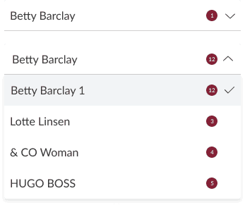
Unable to see how many suggestions are active against a brand
Improvised the brand selector with affordance.
Approach
01
Navigating brands
Why?
Adding the badge against the brand made the experience consistent cross platform allowing retailers to have easy way of knowing the status.
Before
After
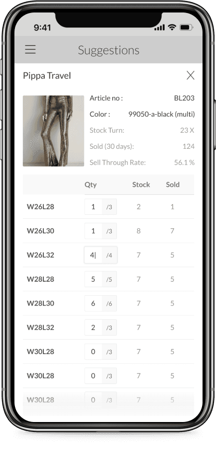
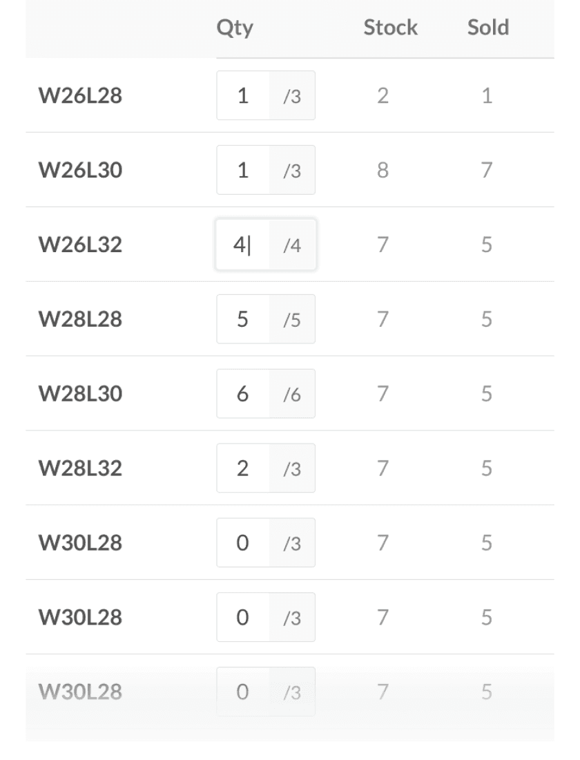
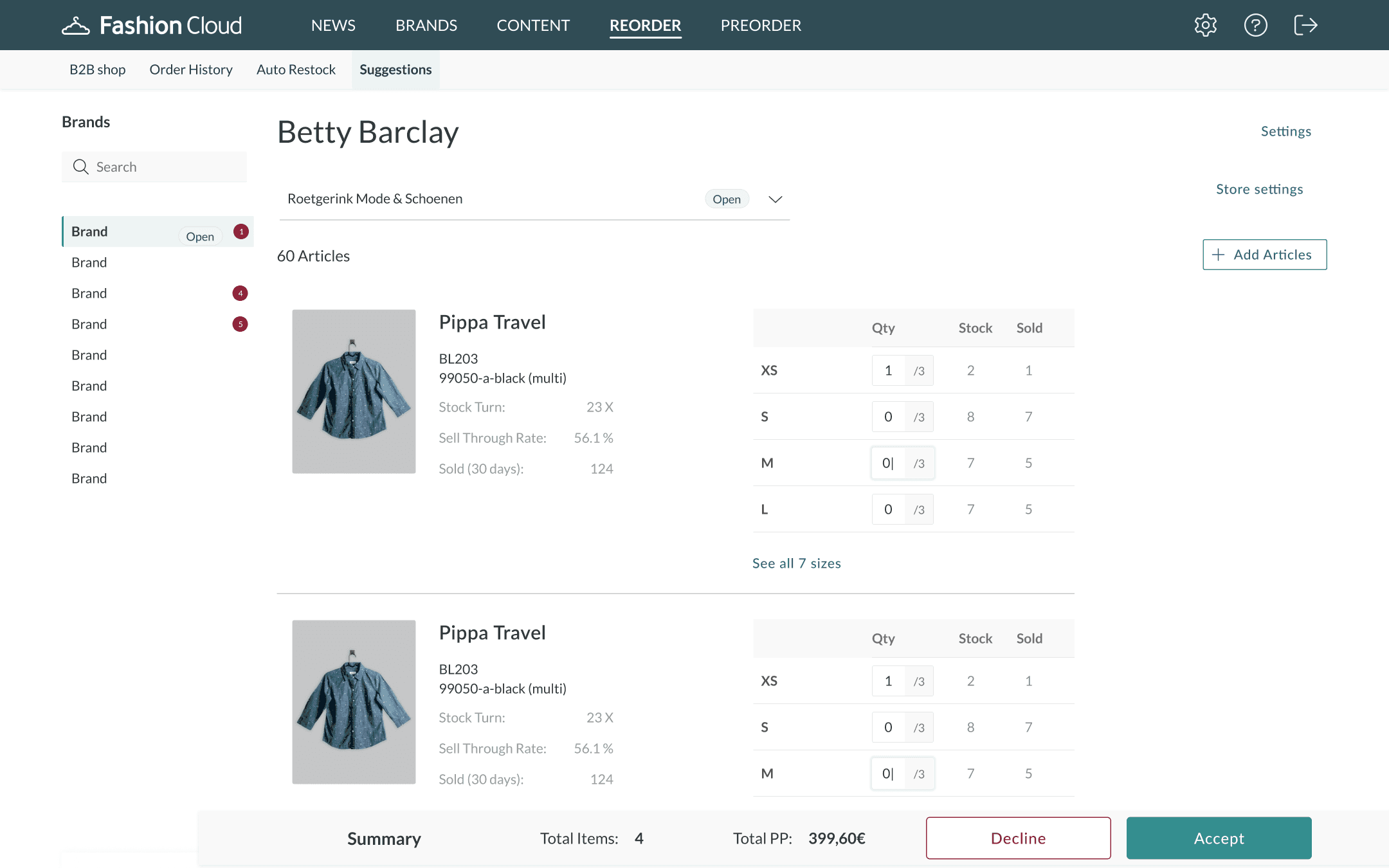
Unable to interact with article card efficiently on both platforms.
Change article card visually.
02
Make article changes
Approach
Why?
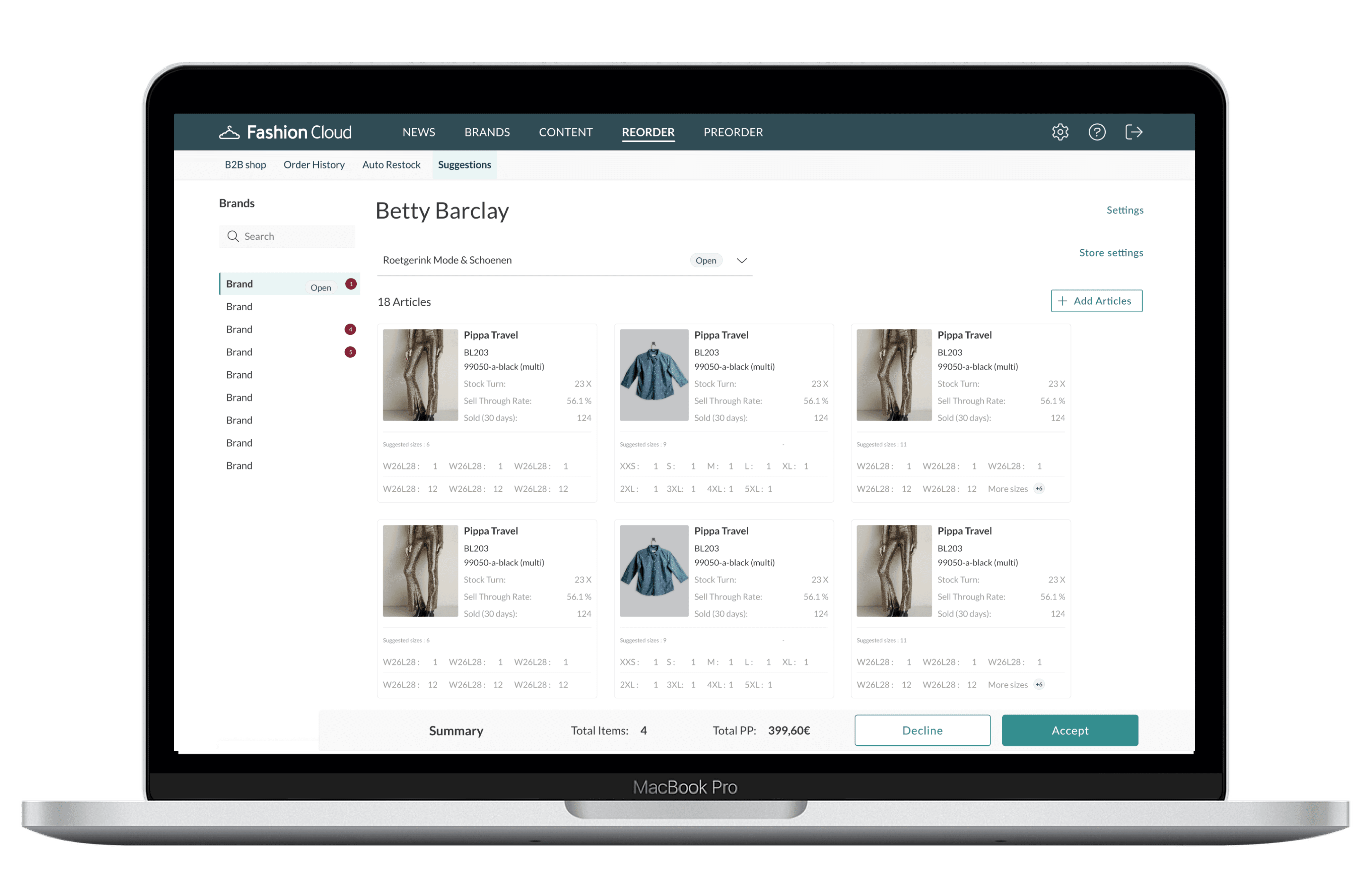
The article card was the primary point of interaction for our retailers, the goal of the design was to allow the retailers to view maximum articles in short span.


Before
After
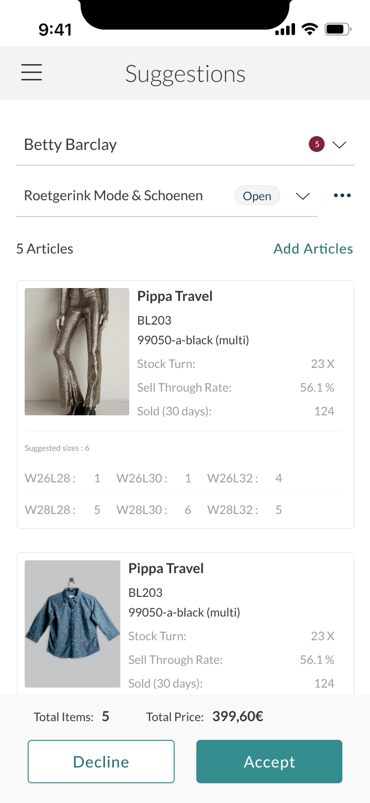
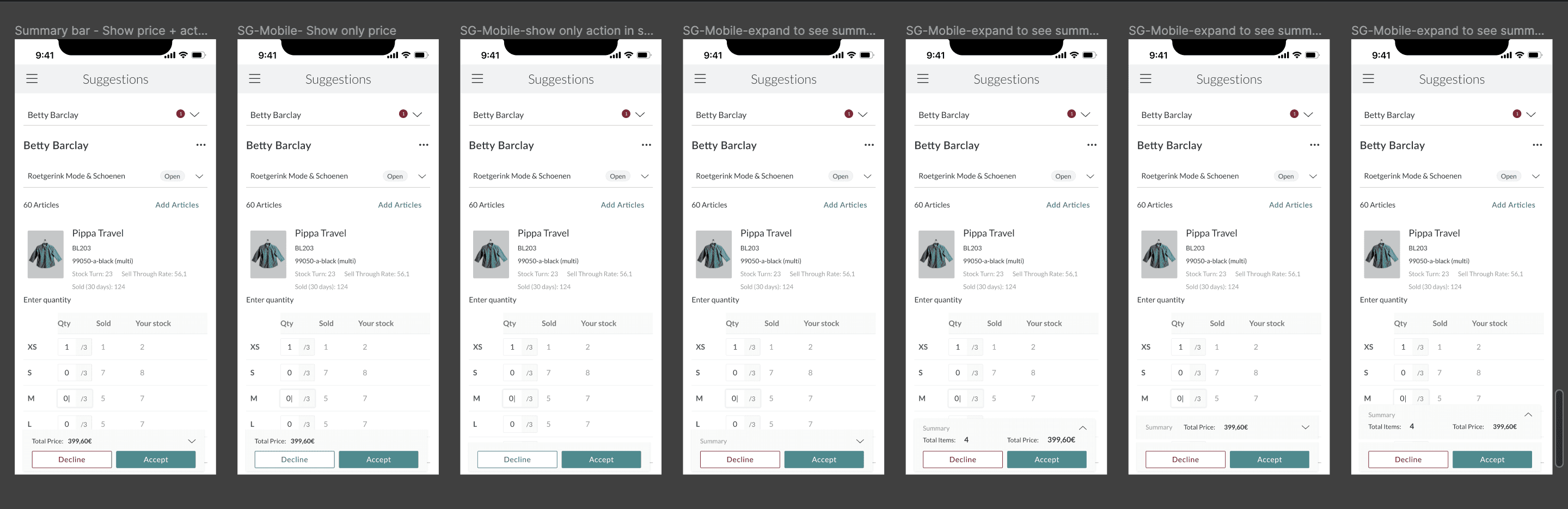
Cannot accept/decline a suggestion efficiently via the mobile interface.
Reimagine summary bar on smaller devices.

03
Taking action against a suggestion
Approach
Why?
Restructuring the information hierarchy allowed the retailer to take action compared to the initial version.
Before
After
Ipad
Decline
Accept
Total Items:
4
Total Price:
399,60€
Decline
Accept
Total Items:
4
Total Price:
399,60€
This aimed to improve the usability on smaller interfaces by enabling the retailer to interact with article sizes in a whole new way.
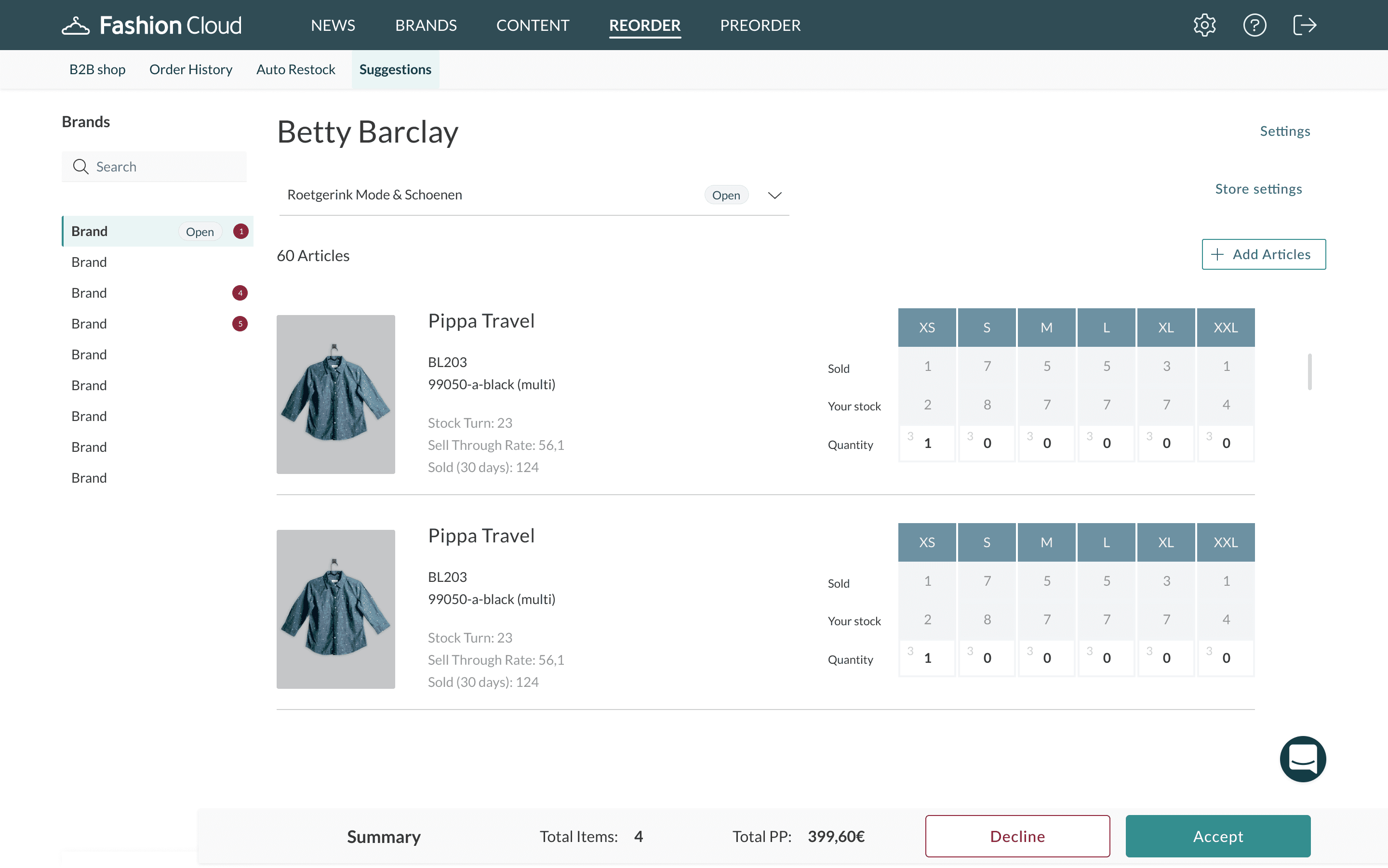
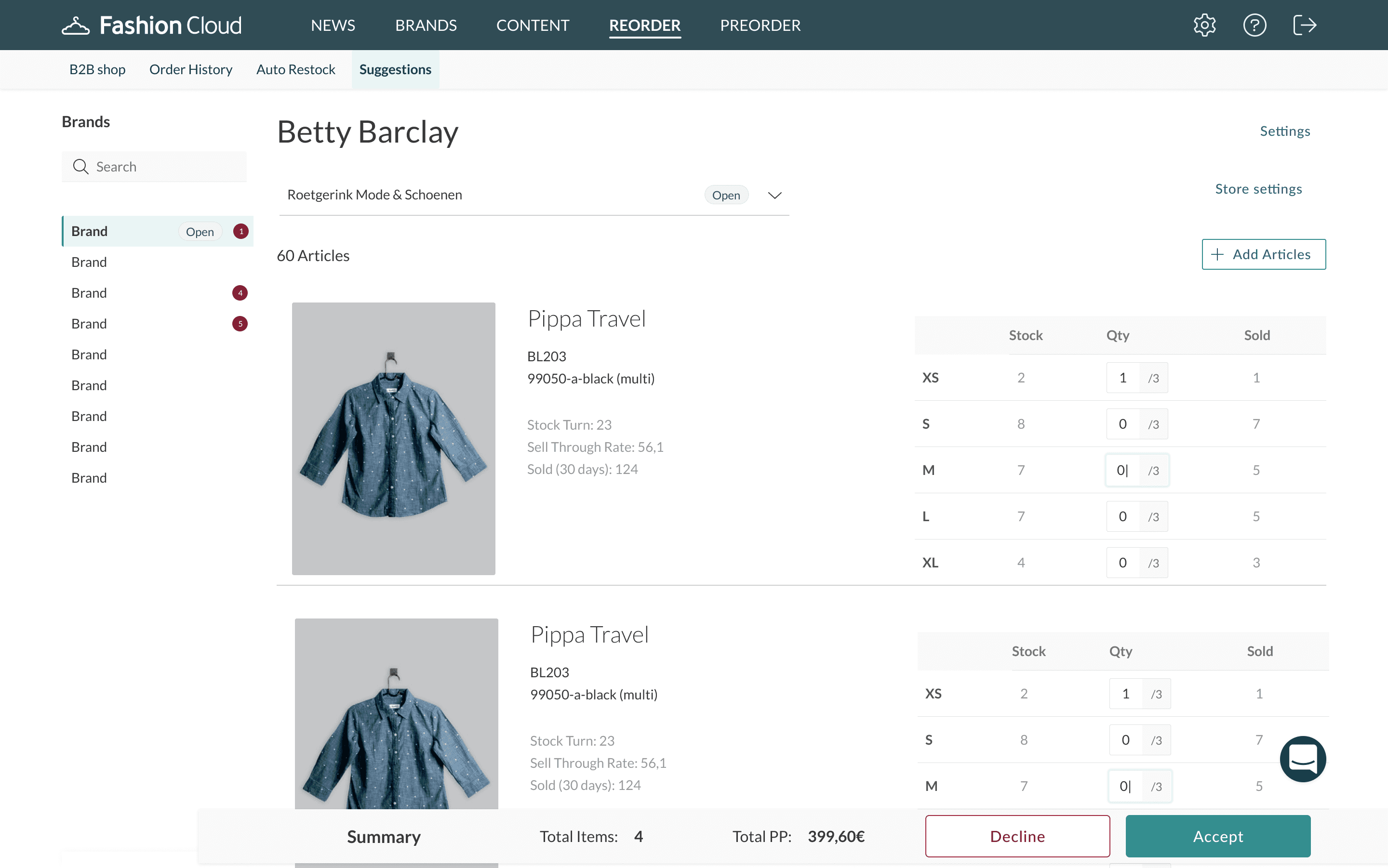
Cannot edit target stocks.
Split action in two views.
04
Making changes
Approach
Before
After
Why?
This allowed the retailer to take action in an easier way when there are lot of sizes involved, especially for trouser articles, leading to minimised scrolling.
Evaluating article card variations
#1 Show suggested sizes
✅ What worked?
Information overload was less.
Focussed view leading to less scrolling within the card.
❌ What missed?
User would have to tap every time to see other sizes and act on it.

#2 Optimizing article cards for mobile
✅ What worked?
One could see total price of the articles suggested.
Less information overload and more action focussed.
❌ What missed?
Needed extra tap from the user to dive deeper into details.
Cards weren't consistent with desktop experience.
Phase 2 : Shaping cross platform
article experience
Evaluating desktop article card explorations
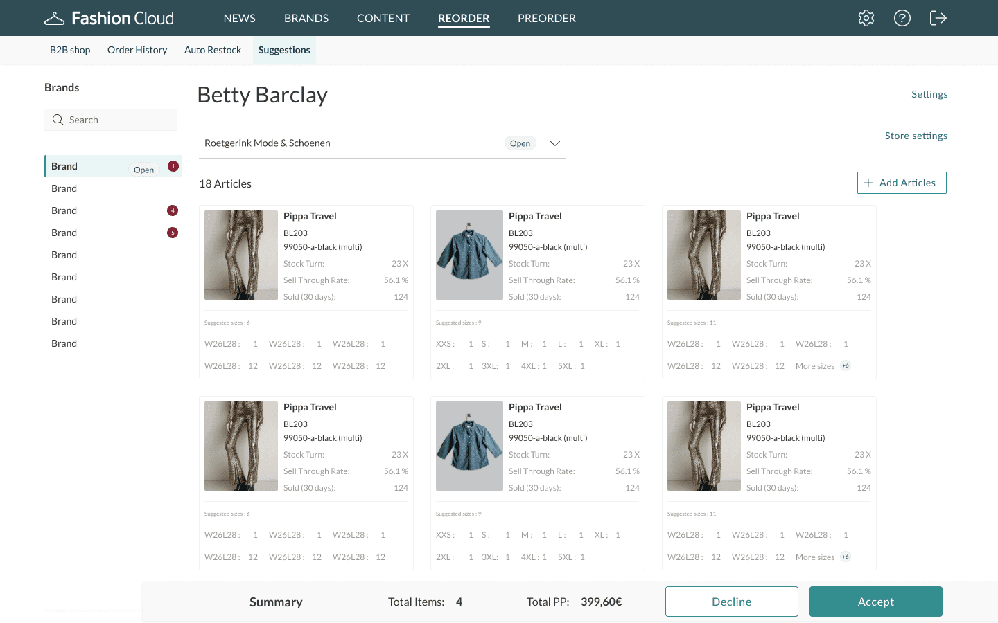
In phase 2, I decided to focus solely on improving the article experience, as I learnt previously from my data analysis, that 60% of the retailers used the desktop version
✅ What worked?
Retailer could see the sizes at a glance and act on it without having to click
Column view allowed to scan in a grid manner compared to list view
❌ What missed?
The size matrix was taking up significant real estate
In usecases where there are 60-100 articles, amount of scrolling was huge
The solution wasn’t scaling to a smaller device leading to increased frustration
01 Scrollable card
Started with basic incremental changes involving limiting the information keeping the status quo intact for 90%.
02 See all
Introduced "See all" to lead the user to check suggested sizes to limit information.
03 Grid view
Experimented with column view to see how can information be displayed. This marked the beginning of moving in a different visual direction.

04 Show maximum articles view
Towards the final stages, I experimented showing a snapshot with relevant details to guide them to see more in less time.
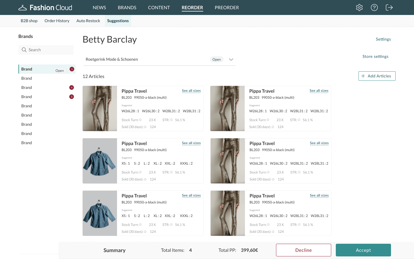
05 Show card hierarchy
One of the final views was a card view where the retailer scans the metrics followed by checking the relevant sizes. The badges allowed them to know if there are more sizes involved.
👀 Maintaining accessibility
During the project, I strived to maintain the overall accessibility by achieving AA- AAA compliance by constantly checking for readability using contrast checkers
The drawer view also allows to navigate between different sizes using keyboard keys which improved the navigation by 40%
🥷🏻 How did I tackle phase 2 challenges?
One of the core challenges was to drive the team buy in, as the solution proved to be visually different. Internally it was presumed to be a barrier to success. I drove the discussion by listing out pros and cons which slowly shifted the narrative to the team being more excited for release.
🥷🏻 Challenging the status quo by introducing drawer functionality
After lot of internal testing, I decided to change the way the retailer consumes information via this card by limiting no.of sizes, further guiding them to interact and edit in a drawer view.
✅ What worked?
Information overload was less.
Focussed view leading to less scrolling within the card.
⏱ Future considerations
Improving drawer navigation.
Allowing retailer to take additional actions from the drawer for Suggestions.
Allowingto see more article information in detail.
This made sure the retailers looked at maximum articles in less time

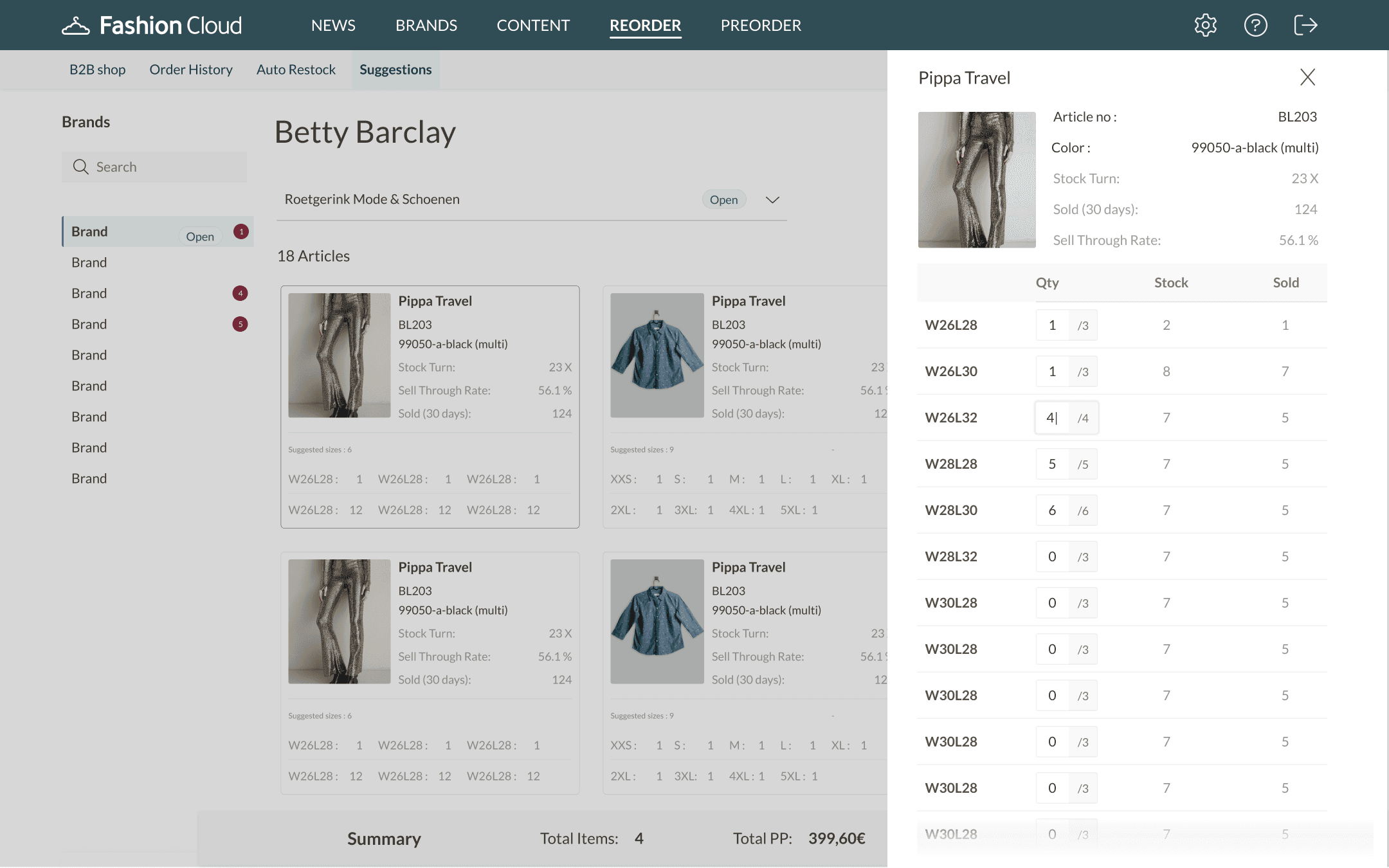
A "drawer" gives retailer the opportunity not just to consume article information, but check additional brand information in the future.
🛠️ Suggestions edge cases
I considered the following edge cases for the future product roadmap,
What happens when a retailer wants to perform additional actions in the drawer view for an article?
What happens when a retailer wants to copy a suggestion to another store and edit it?
What happens when a retailer wants to remove an article by the same brand from one store list but keep it in another store ?
What happens when a retailer wants to edit store settings for Suggestions?
What if the retailer wants to see his articles in his stores all at once?
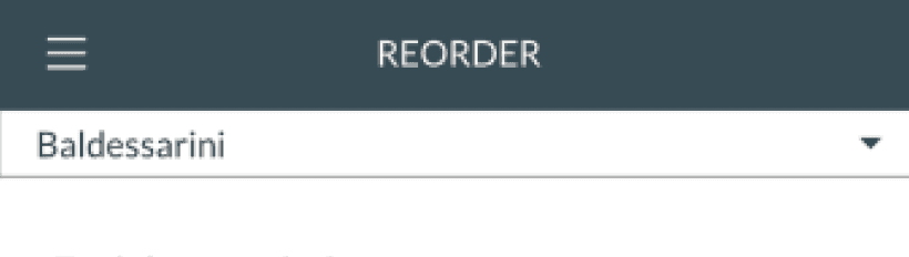
📐 Scaling the solution for Auto Restock
The intent of the design was such that it should be scaled not just across platform but across FC products too.
Auto Restock
Drawer view
The designs were tailored for the specific use case of showing target stock and taking additional actions in the drawer view as compared to the Suggestions view

✅ What worked?
Retailer could see target stocks at a glance.
⏱ Future considerations
User journeys around seeing target stocks for multiple stores.
Incorporating ability to copy & paste stocks between stores & articles.
🛠️ Auto Restock edge cases
I considered the following edge cases for the future product roadmap
What happens when a retailer wants to copy / paste article data to another store?
What happens when a retailer wants to see this article in different stores?
What happens when a retailer wants to see more brand information against the article in the drawer view?
What happens when a retailer wants to delete an article but it is present in one of the stores?
What happens when a retailer wants to adjust a particular store settings from a brand?
🧪 Rigorous testing with retailers
A proper testing framework was missing within the team, this pushed me to create a test plan and test with end users (retailers) before shipping through the below tasks.
01 Edit start date for an article


No. of participants
5 - 10 Dutch & German retailers

Test results
The retailers were able to complete the above tasks successfully with an average task success rate of 80%


👩🏻🏫 Learnings
One of my biggest learnings was to navigate complexity and break down bigger
projects in smaller chunks and constantly be in touch with the end user to grasp
their needs and use it to drive the design at relevant stages.
🧑🏼🎨 Impact as a designer
01 Work
What did I do?
Worked on a solution that helped solve a known retailer problem of not being able to scan information efficiently while accepting brand suggestions or editing stock for replenishment.
02 Output
What did I deliver?
Article card & Drawer navigation as a new way to access product information for retailers.
03 Outcome
What does it achieve?
Improved overall product (Suggestions & Auto Restock) usability by 40%.
04 Impact
What does it change?
Helped increase customer loyalty and trust in the platform leading to a 40% increase in the usability.
Thank you for reading!
Did this pique your curiosity? Say a hello or check another project to know more!
Made with love & coffee
Amsterdam & India